

Imagine your website as a bustling marketplace. It’s the hub of your online presence, attracting potential customers and showcasing your unique customer journey. But what if navigating that marketplace feels like wandering through a labyrinth with no map? A confusing website leads to lost visitors and missed opportunities.

That’s where User Experience (UX) design comes in. It’s the architectural blueprint that ensures your website not only looks impressive but also fosters a smooth and intuitive journey for your visitors. At Moa Studio, we believe exceptional UX design is the cornerstone of successful website creation. Let’s delve into the key principles and practical tips that will transform your website from a confusing maze into a thriving marketplace.
Understand Your Target Audience
Before embarking on any design project, it’s imperative to understand your target audience. These are the valued customers who venture into your online marketplace.
Through user research methods like surveys, interviews, and user testing, you can gain valuable insights into their needs, expectations, and browsing behaviour. This information becomes the foundation for crafting a website that caters specifically to their journey.
Use Personas to Map User Journeys
Think of user personas as detailed customer profiles. Go beyond demographics. Assign names, goals, and even challenges customers may face while navigating a website. This allows you to truly empathise with your ideal customers.

Building on these personas, you can then map out user journeys, outlining the specific steps users take to achieve desired actions on your website. This comprehensive understanding ensures a website experience that feels effortless and guides users seamlessly towards conversion.
Intuitive Navigation
A well-organised marketplace is essential for a positive customer experience. The same principle applies to your website. Utilise information architecture to organise content logically and create intuitive navigation menus.
Imagine clear signage directing customers to specific sections of the marketplace – that’s the power of effective information architecture. Easy-to-understand and navigate menus, strategically placed breadcrumbs at the top of each page, and a robust search bar all contribute to a website with clear navigation.
Guide the User’s Eye
In today’s fast-paced digital world, user attention spans are precious. You have about 20 seconds to grab a visitor’s attention, and even then, they will only scan at most 28% of the text on the webpage (Wyzowl). Effective visual hierarchy ensures your website guides the visitor’s eye towards the most important information.

Think of it as strategically placed product displays within your marketplace. Utilise clear heading structures, concise bullet points, and strategic use of white space to create scannable content that delivers your message efficiently.
Accessibility & Usability for All
A thriving marketplace welcomes everyone. A website should be accessible to all users, including those with disabilities. Following Web Content Accessibility Guidelines (WCAG) can help to ensure elements like proper colour contrast, clear alt text for images, and keyboard navigation options are present.
This commitment to inclusivity allows a wider audience to experience the value your website offers. It’s not just about following guidelines; it’s about creating an inclusive space where everyone feels welcome.
Use Microinteractions to Engage
First time you’ve come across the term microinteraction? Don’t worry, we can help with a user-friendly description.
Imagine a helpful sales associate offering a friendly greeting or providing guidance within your marketplace. Microinteractions serve a similar purpose on your website.
These subtle design elements, like hover effects on buttons or progress bars during form submission, enhance user interaction and provide valuable feedback. Strategically implemented microinteractions can significantly improve the overall user experience.
Compelling Calls to Action
Imagine clear signage within your marketplace directing customers towards special offers or checkout areas. Effective Calls to Action (CTAs) on your website serve the same purpose.
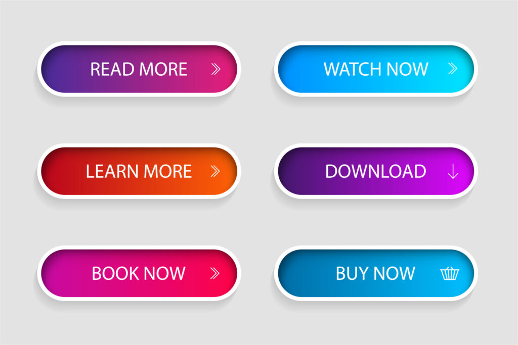
Whether it’s a compelling “Buy Now” button or a strategically placed “Subscribe for Exclusive Offers” form, CTAs tell users exactly what action you want them to take next. Clear and concise CTAs are essential for driving conversions and achieving your website’s goals.
Mobile-First Design
The modern marketplace thrives on mobile accessibility. Prioritising mobile-first design principles is essential. This ensures your website automatically adapts to any screen size, offering an exceptional user experience regardless of whether visitors access it on a desktop computer, tablet, or smartphone.

Think of it like this: mobile users are the majority these days, and if your website isn’t mobile-friendly, it’s like closing your marketplace during peak hours. Mobile-first design keeps your virtual doors open to everyone, everywhere.
Moa Studio is here to help!
By implementing these UX design principles, Moa Studio can transform your website into a thriving online marketplace that not only captivates visitors, but also converts them into loyal, paying customers.
Let’s work together to craft a website experience that’s both beautiful and functional, ensuring your online presence flourishes. Contact Moa Studio today for a free consultation.


